Comments on black-and-white-inkjet-printing
INTRODUCTION
No doubt, the black-and-white image stays at the beginning of the history of photography and has lost nothing of its importance to this day. Today, photographs are taken digitally and the images are posted - really?
It is not only the old veterans who mourn the wonderful prints on baryta paper. All those who have held such a print in their hands have been surprised to discover what peculiar sensations an image on this material can trigger. It is therefore logical that digitally produced images should also be given this special aura. This has nothing to do with a nostalgic transfiguration of an old technology, such as adding film grain to a sharp digital image to simulate the "look" of an analog print. For that matter, paper as an image carrier simulates neither the past nor the future. The paper is the medium that acts in the instant, it grants the image the support to be held in ones hands. The paper acts on my senses of touch and of sight through the light of the environment. Today, the industry offers a wide variety of papers for the production of digital prints, onto which the digital image information can be transferred using appropriate equipment.
The transfer of digital image pixels to paper began around 1960 with a patent by Helmut Hertz of Lund University for a continuous inkjet process, which was then licensed by Iris Graphics and resulted in their Iris printers for the rapid production of prepress control prints. Graham Nash used it to produce prints of his paintings, and Jack Duganne named this process "giclée" because he thought it gave a more valuable impression in the art world than a name in which the digital method of production was immediately apparent. Giclée prints can still be seen here and there in exhibitions. Interestingly, however, there is still no generally accepted name for digital inkjet prints in the art world. Technical development continued apace. Today, Canon, Epson, hp, and others have brought the technology to the point where digital art printing is affordable even for ambitious amateurs and fits on a small desk. (https://www.stansherer.com/Iris_2.htm). With a manageable investment is now possible for the enthusiast to create black and white prints that are not inferior in quality to a print on the legendary Brovira paper, and in the case of matte papers, can even surpass them in my opinion. So the technology for a functioning digital darkroom exists. But in order to achieve "fine art quality", as with analog (wet chemical) technology, there are a few hurdles to overcome.
When image information exists in digital form, one has almost unlimited technical control over the processes that once in the analog era were called image development and enlargement. Digital procedures can be used to shape the image result within wide limits. All the more it is important to have a precise idea of what the final image should look like, or as Ansel Adams once remarked: "You don't take a photograph, you make it". This essay presents a way to realize this idea on paper. My experience shows that there are no shortcuts along this path. As always with a journey, getting started is important, so first things first:
THE DIGITAL DARKROOM
In the beginning there is the "darkroom". As in the analog photographic world, in the digital darkroom the images are developed and enlarged, i.e. printed. The digital darkroom consists of a computer equipped for image processing, a calibrated monitor with a large gamut and an internal LookUpTable (internal LUT), an inkjet printer and a photometer. A comprehensive overview on monitor calibration can be found here.
Nevertheless, here a small addition to the topic about computer equipment: Photoshop mainly uses only one CPU core, except for a few filters. So for image processing a 4-core CPU is quite sufficient. More important than the number of cores are the clock speed, a sufficiently large RAM (>=16 GB) and a graphics card/driver + monitor that support 10-bit color displays, e.g. Eizo Color Edge monitors and Nvidia Quadro graphics cards.
I do the development of images in RAW data format in Capture One Pro, and for image processing I use Photoshop. But there are also other programs. Even with those that cost nothing, such as Gimp or darktable, excellent results can be achieved. Image processing should be done in a room with dim light, so that the monitor display is not disturbed by bright ambient light. For image evaluation - even for black and white prints - an environment with controlled light color and intensity is advisable. For this purpose, I have carpentered a furniture niche painted with white walls (barium sulfate/Blancfix paint - preferably no titanium dioxide dispersion from the hardware store) and equipped it with a D50 standard light fluorescent tube from Just. Accordingly, the monitor white point is also calibrated to D50 light and the spectrophotometer i1Pro determines reflectance data evaluated according to D50 illumination.
LEITMOTIF --
PREREQUISITES FOR GOOD PRINTING
AND COMMENTS ON LIGHT COLOR
My point here is not printing an image to look good, because that would be a discussion about a matter of taste, like "what is the most beautiful letter in the alphabet." So, the other way round, what exactly is printing about? In the digital age, images are processed in the computer and displayed on the monitor. On the monitor, so to speak, crystallizes the photographer's artistic intent. The reference therefore is the monitor image. My leitmotif for the printing process is therefore,
This is not a matter of taste. Unfortunately, the comparison of the printed image with the monitor image cannot be made in terms of an unambiguous measurement. The monitor image itself is self-luminous - the light source is located behind the image, so to speak, and shines through it - the printed image, however, must be illuminated by an external light source. The light from it first passes through the printed pigment layer, is then scattered on the white paper backing, and then passes back through the pigment layer to the outside to the viewer. Monitor and print - these are two fundamentally different processes, each involving parameters that cannot be related to each other. For example, the maximum light contrast that can be displayed: A good LCD monitor achieves a contrast ratio of 1:300 at a luminance of 160 cd/m^2. A good matte paper only achieves about 1:45. Nothing significant can be done about this discrepancy. What harmonizes best with our sense of perception is an adjustment that ensures that the average image brightness (average gray value) match, and at the same time the brightness differences (local contrast) on the monitor are translated in a proportional way into black-differences in the image.
This is a taste-neutral criterion that can also be measured. That this is not easy, however, is often heard: "I bought the best printer, and yet my printed image is much darker than on the screen. I can't see the structure in the shadows that I saw on the monitor". Well, possibly the plaintiff has been bungling on two points: At the basic configuration of Photoshop or at the setting of the monitor or at both.
BASIC SETTINGS IN PHOTOSHOP FOR BLACK AND WHITE IMAGES
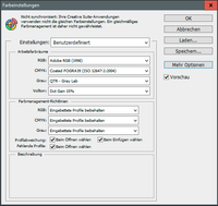
When importing an image, Photoshop needs to know how to interpret the camera's pixel data. That is, Photoshop must locate the image information from the camera's RGB sensors in a model of human color perception. This is done by the "working color space" into which Photoshop places the RGB coordinates. My camera places the images in the Adobe RGB (1998) working color space (that's how I set the camera) and that's where they are left when developed in the RAW converter. What Photoshop should do when importing the image has to be defined (because there are other color spaces). This definition is in the <Edit> <Color Settings> table under Working Color Spaces. I leave the image in the Adobe RGB (1998) space. If exceptionally I am editing an image for display on a web page, I can always convert to the working color space sRGB (color appearance is preserved, pixel data changes according to the color location in the new color space).
What does Photoshop do when converting an RGB image to a black and white grayscale image? (the question arises for all image processing programs) The three-channel color information RGB (or Photoshop-internally L*a*b*) is reduced into the one-channel brightness information "Luminance L". But also the luminance has to be interpreted, has to be put into a gray color space. Also for gray level images there are different working color spaces, which put the luminance coordinate in correspondence with a human brightness perception. Common, and included in the out-of-the-box edition of Photoshop, are two spaces: "Gray Gamma 1.8" and "Gray Gamma 2.2". They differ in what contrast sensitivity the values of the L* coordinate are transformed to. (Gamma is a measure of contrast, more precisely the slope angle of the tangent to the classical, S-shaped gray curve at medium gray values). However, this immediate way of linking the gray working color space to human sensation does not bring processing and printing of black and white images into an optimal, harmonious interplay, and is often a reason for the above-mentioned complaint. For: if we picture a lemon in color, we may wonder whether in the print the yellow of the lemon is rendered in a natural way. But if the lemon is depicted in black and white, the corresponding question makes no sense. The question "Is the gray value of the lemon natural?" is obviously meaningless. Consequently, when we edit and print black-and-white images, the "naturalness" of the lemon must be given shape by other means. After all, that is precisely what fascinates us about black-and-white photography! The example illustrates why the L*a*b* color space, in which brightness and color information are separated, was invented for image processing and the related issues.
So what does the gray color space has to do for us who want to print a B&W image? The gray working color space is supposed to help us get the image from the screen onto the paper in a predictable way. To put it more precisely:
--- The ratios of two brightness values on the screen should be transferred to the printed image with a constant proportionality coefficient, independent of the respective brightness value. ---
The answer is therefore clear: the appropriate gray working color space is one that preserves the ratios of two gray values over the entire scale of gray values, that is, one that transforms them "linearly" (mathematically speaking).
Interestingly, it took a while for someone to construct such a "linear" gray space and define it as a working profile. In the early 2000s, as more and more people became dissatisfied with their black-and-white prints, some pioneers began converting then-available good color inkjet printers into black-and-white-only printers. Based on some good printers from Epson, they managed to replace the color ink cartridges by gray cartridges containing black ink of varying concentration (cf. piezography.com). The control software for this modified printers was written by someone who also had an excellent knowledge of color management and the then new ICC system: Roy Harrington. (ICC: International Color Consortium). A linear, gray (single-channel) ICC working color space became part of his software in 2005. Unfortunately, the ICC profile belonging to this working color space is not delivered with Photoshop. It is part of Roy Harrington's software package for professional Epson printers "QuadToneRip - QTR", which he has meticulously maintained ever since. (RIP: Raster Image Processor, QuadTone: Four (and more) gray inks can be controlled). The package includes mentioned B&W color space and some other programs not tied to a printer brand, which I will discuss below. QTR is available as shareware for $50.
After QuadToneRIP is installed, you can find the QTR profiles in the <programs>\QuadToneRIP\icc\ directory in Windows. Install the three profiles Gray-xxx.icc by right-clicking or copy them manually into the directory c:\Windows\Systen32\spool\drivers\ color\. Then start Photoshop and open the window under <Edit> <Color Settings>. Activate the profile "QTR - Gray Lab" under "Working color spaces - Gray" (see figure). This would prepare the operating system and Photoshop for printing. Now we come to the monitor.
MONITOR SETTINGS
Our goal is, after all, a printed image whose brightness ratios correspond to the image on the screen. Since our visual perception system for brightness is not linear, the visual evaluation of this can only work if on the retina of our eyes the screen brightness and the brightness of the paper appear comparable. Let's start with the screen. It is essential to calibrate it correctly with a photometer. The software for this usually is included with any monitor suitable for image processing (e.g. ColorNavigator from Eizo) or it is supplied with the photometer (e.g. i1 from x-rite). The calibration software usually has specifications for "photography", "prepress" or "softproof". Since for processing images I have decided on the color temperature D50 (approx. 5000 K), I choose a corresponding D50 variant. The luminance will then be between 130 or 160 cd/m^2. Which one is choosen is a matter of taste. The brighter one is naturally less sensitive to ambient light. If you work with dimmed ambient light, which I recommend, 130 cd/m2 is more pleasant and less tiring. If you can also set the shape of the tone curve in the calibration software, you should definitely select L* (LStar). This corresponds to a linear reproduction of the luminance.
ADJUSTMENTS AT THE LOCATION WHERE THE PRINTOUT IS INSPECTED
After the monitor has been profiled, call up a white page in the computer, e.g. a blank text page, and measure the brightness with a light meter at the viewing distance. Now go to the image inspecting location, take a blank sheet of white paper and measure the brightness again with the light meter at the viewing distance. Vary the distance between the illuminating light source and the paper sheet (keeping the distance between the paper and the light meter constant) until the measured brightness corresponds to the brightness measured on the monitor. This constellation should then be used to compare the images. In other words: This is the correct distance of the light source to the paper. (If no suitable light meter with a small measuring angle is at hand, you can help yourself with the camera light meter (spot metering) - ISO fixed, time fixed, read off the aperture > adjust to the same aperture).
REMARKS ON LIGHT QUALITY
The standard color temperature D50 corresponds approximately to a blackbody temperature of 5000 K, i.e. to summer sunlight in the middle of the morning or afternoon. Unlike silver bromide prints of the analog era (Brovira), color temperature plays a more important role in inkjet printing. The black pigments in silver bromide printing is determined by the light absorption of nanometer-sized metallic silver crystals, which is only weakly dependent on wavelength in the visible spectrum. In contrast, the black pigments in the ink of inkjet printers consist of carbon black. Depending on how this is produced, the result is a more or less neutral black. The light absorption of this "carbon" black, however, is more wavelength-dependent than that of the nano-silver black: light with a blue wavelength is absorbed a little more strongly than red, so that the carbon black ink gets a "warm" appearance. We will come back to this further below. Therefore, in order to obtain neutral black in inkjet printing, small, matching portions of color inks must be printed along with the black inks. With the color pigments, however, one buys the danger of metamerism effects: An inkjet print that has a neutral gray in D50 light can, for example, exhibit a green tint in LED light, which can change to reddish in lighter image parts. The metamerism effect is particularly pronounced if the light sources have isolated emission lines in the blue, such as metal halide lamps or cheap, so-called white LED spotlights. Papers that are strongly brightened also behave unpredictably. For this reason, we advocate standard light for image evaluation of inkjet prints. Standard light for visual assessment is a prerequisite, especially for the procedures described below for neutralizing black tones. But there are also consequences for the lighting of images in an exhibition: Before printing the images for an exhibition, check the light quality on site. Non-neutral gray gradients in a large printed image are immediately noticeable and make both the printer person and the photographer appear in a unfavorable light. For galleries, therefore, it would be important to use light sources with a smooth, continuous spectrum. In this sense, halogen lamps were less problematic than LED spotlights. For colored exhibits, this warning is even more true.
Now, if the following tricks for printing are taken into account, there should be no more complaints regarding "drowned" shadows.
THE PRINTING PROCESS
In the following, I will limit myself to my experiences with the Epson SureColor SC-P800, useing the original pigmented inks. I run the software under Windows 10, but some of the information could be appropriately applied to the Mac or a Linux machine, whose printing systems, however, have a "personality of their own" that is foreign to me.
For black and white printing, I discuss two options: 1) printing from Photoshop using Epson's generic driver, and 2) save image in TIFF format and print using the standalone QuadToneRIP program. Both options will produce acceptable results with good paper and the standard settings supplied with the driver, or the program. More demanding photographers, however, will not be satisfied. Better, even perfect results that are at least as good as silver halide baryta images were, are possible, but require a little more attention. In the following, I discuss the necessary preliminary work.
BLACK AND WHITE PRINTING WITH THE EPSON ABW DRIVER
N.B.: The Epson printer driver offers the Advanced-Black-and-White mode (ABW mode) only for dedicated, higher-quality paper types.
SOME COMMENTS ABOUT THE EPSON ABW MODE (ADVANCED BLACK AND WHITE)
If we print a color image using the normal printer driver, it takes the image from its RGB working color space (e.g. AdobeRGB) and transforms it into the device color space defined for the printer-paper combination in question. The printer driver obtains the information about the properties of this device color space from the specific ICC device profile. If, on the other hand, we print a black-and-white image via Epson's ABW mode, no ICC profile is called up. However, since there must be a profile for controlling the ink nozzles, this means that the printer uses an internal, proprietary ABW profile. For the print settings in Photoshop, Epson therefore recommends setting "Color Management by Printer" (NB: In Photoshop versions CS4 and before, the recommendation was "No Color Management"). This results in the RGB image data being sent from Photoshop directly to the ABW driver. The ABW driver can handle both pure grayscale images and color images. An RGB color image will be converted to a grayscale image by the ABW driver. Giorgio Trucco has found out by an intelligent experiment that the ABW driver converts from RGB (0-255) to black K(0-100%) by means of the formula usually used for this purpose
K(%) = (255-(0.3*R + 0.59*G + 0.11*B))*(100/255) .
BTW, this is also the formula that Photoshop applies when changing mode RGB color to grayscale. So the ABW driver is able to process pure grayscale images, RGB color images and R=G=B encoded grayscale images. If one would try to tint a grayscale image in RGB color mode and print it via the ABW driver, the tinting consequently would be lost. However, the ABW driver has built in capabilities for classic B&W image tinting.
In the following, the profile-based ABW workflow is described, which guarantees a good match from screen to printout. This workflow differs in several ways from the official standard Epson ABW procedure.
CREATING A GRAYSCALE ICC PROFILE FOR ABW PRINTING
The workflow here described is inspired by the work of Eric Chan: https://people.csail.mit.edu/ericchan/
In above mentioned QTR package one finds in the <Eye-One> directory, a grayscale wedge, the target Step-21-gray.tif. Print this in Photoshop at 100% scale with the following settings in the Print window:
- Color handling: Color management by printer
- Render priority: Does not matter.
- Scale: 100%
- Printer driver settings: >> Print settings button:
- Media Type: Set the paper manufacturer's recommendation for the printer in question. If there is no recommendation, choose Velvet Fine Art Paper for matte papers (MK ink), or Epson Premium Luster for smooth/glossy papers (PK ink).
- Color: Advanced B&W Photo
- Print Quality: For PK ink: Max Quality; for MK ink: Quality
- Mode: Neutral
- "Advanced..." button - Color Toning: Neutral; Tone: Dark, or Darker. The default setting is Dark. Depending on the paper coating and ink absorption capacity, one or the other setting leads to more linear results. My experience: Many MK ink papers deliver more linear results with Dark. Leave all other settings at the default settings for now.
Print the grayscale wedge with these settings and let it dry well. Measure the gray wedge with a spectrophotometer. I use the i1Pro from X-Rite with the software ColorPort and the target template 21-step-gray-i1Pro-bySM.rwxf from Scott Martin. At the save window set: Format (Tab separated), Conversion (None(s) (XRGA)), End of line (Windows, or used operating system), Enable Lab, Illuminant (D50), Observer (2). Save with a meaningful name, e.g. PRINTER TYPE_PAPER TYPE_GRAMMATURE _ABW.txt .

In the QTR package there are some programs (exe files) in the <Eye-One> directory. We use the file QTR-Create-ICC-RGB.exe; copy/link this file e.g. to the desktop. Now drag the .txt file saved from ColorPort to the QTR-Create-ICC-RGB icon. In turn this program now generates a text file, which opens now; see example on the right.
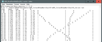
At the same time as the ...-out.txt file the program has also created an icc profile which for this moment we disregard and delete. The text file (example above) also contains a rudimentary graphic with the gray values (L-curve) and the tone of the corresponding patch in a,b coordinates. At Step=0, the Lab color coordinates of the unprinted paper base are shown as if illuminated with light of color D50. The a and b coordinates represent the tone of the paper-ink combination. Step=100 corresponds to full ink application. Dens shows the maximum achievable density dMAX in this line. The coordinates of the unprinted paper (line Step=0.00) characterize its tone - warm paper or cool paper (b negative), as in the example here. Since no ink is applied, these coordinates can not be changed. In the same way, practically nothing can be changed in the a,b coordinates when 100% ink is applied, because no color ink can prevail against the black ink. At least not with the possibilities provided by the ABW driver.
In the following steps we will try
- to to make the L-curve as straight as possible. We start at the Tone field in the Color Controls window of the ABW driver. In addition we use the Brightness and Contrast sliders to control the course of the L-curve. Brightness shifts the center of the curve to (+) brighter, (-) darker; Contrast (+) makes highlights brighter and shadows darker, or (-) the other way around.
- to make the a- and b-curves run as evenly as possible and monotonically, from step zero to step 100. This can be controled with the Horizontal (a-axis) or Vertical (b-axis) color control fields. The Horizontal and Vertical controls mainly affect the midtones around steps 45 to 75. Unfortunately, variations in Horizontal and Vertical do not behave completely independently, i.e. orthogonally. A change in one also affects the other a little. This has to do with the fact that the driver has to make these changes by mixing the existing color inks. However, the color inks have portions in both a- and b-parts that cannot be decoupled in a simple way.
Our goal is to obtain gray tones that are as neutral as possible in a and b, i.e., run close to zero, on the one hand, preserveing the character of the paper, both in the highlights and in the shadows, on the other. However, not much can be achieved in the deep shadows, where the black ink tone dominates. What should be avoided at all costs is a gray gradient that is warm in the highlights and changes to cold towards the shadows. This is completely unaesthetic and is noticeable even to a layman. When printing on "foreign" (not Epson) papers with the ABW driver, this can happen.
To achieve gray neutrality, the described steps are repeated until a satisfactory result is achieved. We save the icc profile generated in the last step and load it into the profile folder of the Windows operating system by right-clicking. We save the last settings in the ABW printer driver with Select Setting with a meaningful name. We will now use this driver setting and the associated profile for prints on the paper in question.
If effect tints, such as sepia or cold tone, are desired, these can be made via the Tone, Horizontal and Vertical fields. The linearity of the ink application is essentially preserved.
Example of print settings in Photoshop:
ABW PRINTING WITH ICC-SW PROFILE
We finally come to the printing of an image: In order to print under Photoshop with the ABW driver, we do something that normally is considered wrong: We profile quasi twice. In the print window of Photoshop, contrary to the Epson recommendation, at Color Handling we define the setting "Color Management by Photoshop", and at Printer Profile we set the ABW profile matching the paper; Render Priority: Perceptual without Depth Compensation. The Print Settings button takes you to the driver settings. Select Setting selects the settings saved for the profiled paper. To be on the safe side, check the Print Preview box. This gives you a final check to make sure that the image is correctly positioned on the printed page.
What are the benefits of profiling? Here is a comparison before/after with a strongly brightened paper (much OBA), Ilford Premium Matt Duo 200, or Tecco PD190 DUO Matt:
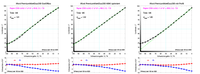
We see that the intervention of the profile has pulled the L-curve overall to darker values. The profiling brings the gray tone center of the screen at K=Step=50 from the (before) gray value L=55 to (after) L=50. This is probably the most important consequence of the profiling program. It tries to create as straight an L-curve as possible in the light to medium gray tones, which results in an ink application with L=50 at K=Step=50. This ensures that for all papers up to the darker mid-tones (K= approx.70), local contrast shown on the computer display is correctly represented in the printed image. How the blackening curve is continued in the deep shadows depends on the maximum black reproduction (dMAX) of the paper. This in turn is determined by its ink absorption capacity and surface characteristics. For most matte papers, a linear continuation of the curve into the maximum black is therefore not possible; cf. upper graphic. In this range, the profile will try to create a balance in the tone gradation so that texture is still visible even in the deepest shadows. In this range inkjet papers differ consideraby. The much-cited parameter dMax (Maximum Density) identifies the property in question. In the above example, the dMax value at Step=100 as shown in the "Dens" column is 1.60, which is a fair value for matte papers. (dMAX characterizes the reflected portion r of incident light at full ink coverage: r =1/ 10^(dMAX); example: 10^(1,60) = 39,8, so at the blackest point the 1/39,8 part of incident light is reflected).
Comparing the above curves, one could argue that printing without profile on this paper would produce a (visibly) brighter image, but it should exhibit a slightly better tone separation (texture) in the deepest shadows; cf. middle curve. This is quite true. But the print results will then appear visibly brighter than on the screen, and - perhaps more importantly - the print results on different papers will no longer be comparable and predictable. In particular, this will be the case in a serious way when switching from a matte paper (MK ink) to a glossy paper (PK ink). Nevertheless, this printer setting can be useful. Especially if distinct low-key images (mainly the dark half side of the histogram is filled) are to be printed on matte paper, this print setting can lead to very good results.
The profiling of the ABW workflow thus ensures that the brightness of the printed images does not differ significantly when changing the paper brand. In particular, the brightness impression on the monitor image is always transformed into the paper image in the same way. Even if the comparison of the self-luminous monitor image with the printed reflective image is problematic, the profiling ensures a certain stability of this transformation so that unpleasant surprises are avoided, which in the end also saves paper costs. Above diagrams also illustrate that profiling does not interfere in a visible way with the a,b color values of the gray tones. On the other hand, the graphs suggest that the maximum density dMax for a given paper is determined by the ink. Interventions via the ABW settings or profiling have no effect on dMax.
The profile produced according to the above workflow is a black and white profile. Therefore, the profile only affects the black inks. However, as shown above, the color tone of the black inks is not completely neutral gray. Therefore, the ABW driver offers possibilities to compensate color casts in the gray via the settings Color Controls - Horizontal/Vertical or, as in analog B&W photography, to realize desired tints. However, these color settings of the driver are mainly effective in the range of the middle gray values. If for whatever reason you want to do more or access the gray and color inks individually, the ABW driver does not offer any possibilities. But there exist tools for this: the RIP, Raster Image Processor. In the past, those were understood to be systems that converted vector graphics into raster data to be processed by a printer. Today, RIPs are sophisticated systems that can accept all types of graphic data and convert them into control data for a printing system. In addition to the commercial programs, there is an excellent shareware program for Epson inkjet printers, QuadToneRip - QTR, mentioned above, which we will highlight below.
BLACK AND WHITE PRINTING WITH QTR, QUADTONE RIP
The software was created to control Epson's large format printers equipped with multiple gray inks. As befits a RIP program, it offers a wide range of setting options. Since it is not a commercial program, you have to adapt it to your needs yourself. A little experience in analog photography and color theory is not a disadvantage. For the Epson SureColor P800 printer, only qidf sample profiles for Epson Enhanced Matte, Epson Premium Photo, Hahnemühle Baryta and one generic profile each for MK and PK ink papers are delivered. These can be used as a good starting point for your own profiling, which will be discussed below.
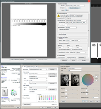
After installation (see above), you start the program via the QTRgui graphical user interface, which presents itself like this:
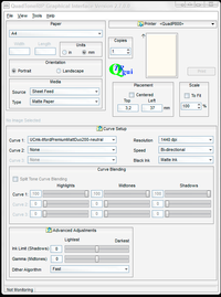
The first thing to do is set the printer via the selection button. In my case, this is the Epson SC-P800, referred to here as <QuadP800>. After that, in the Paper field and in the Curve Setup field on the right, the appropriate specifications are made. (Resolution for matte papers 1440 dpi, for glossy also higher.) The specifications here should match the settings to be made at the printer. Under Curve 1, the paper profile should be selected. My example paper Ilford Premium Matt Duo 200 is not in the list and I'm going to create a profile for it now, which I will describe briefly below. Before we start, let us take a look at the directory where QTR resides, c:\Program Files (x86)\QuadToneRIP\. There we find in the subdirectory QuadTone all Epson printers that are supported by QTR. Our printer can be found under QuadP800. If we open this directory, we see the profiles for which Roy Harrington has created a profile. With these profiles acceptable prints are possible also for other papers, as long as the PK/MK ink type is respected.
Four preliminary remarks about creating QTR profiles:
- When updates of QTR are installed, the profile folder is completely deleted and rewritten. For this reason, any personal profiles, i.e. the self-created profiles, are stored in a save place that is not deleted, namely the "hidden" directory: C:\Users\<username>\AppData\Local\VirtualStore\Program Files (x86)\QuadToneRIP\Profiles\QuadTone\.
- As Raster Image Processor, QTR allows control of all inks, especiially printing with the black inks only. As mentioned above, this results in a "warm", yellowish black tone. Normally, one will save a pure black ink profile, "black only", under the name UCxk-...-warm.
- The creation of a profile is done in two procedures. In the first one the ink absorption capacity of the paper is determined: "Ink Limit". Caution: not that the more ink the better, on the contrary! In the second working procedure, the desired black tone is mixed. In both procedures, linearization is used. We have reported about linearization above, and we will have to talk about it again. My approach results in a sequence of steps not quite following the official user-guide line.
- Here again, we have to characterize grayscale wedges. I use X-Rite's i1Pro with ColorPort software for this purpose; cf. the comments at ABW printing. But you can also help yourself with a good flatbed scanner by measuring the scanned fields with the Photoshop pipette (switch RGB color space to Lab!).
FIRST WORK PACKAGE: DETERMINING AND SETTING THE "INK LIMIT"
How much ink a paper can absorb depends mainly on its coating. If more ink is applied than the paper can absorb, this "overflow" will remain on the surface and after the solvent dries, the pigments will be left behind as a film. This overflow film usually has a gloss that is very different from the normal paper surface. It is also touch sensitive and smears easily. It also does not contribute to deeper blacks. Often just the opposite is the case.
QTR offers a tool to detect and regulate this overflow limit. A detailed description of the steps can be found under the menu item - Help - User guide. A German version was made by Rainer Taube, see www.tauberlin.de/QTRKurven.pdf. I limit myself here only to a concise recipe.
- Call the tool clicking: Tools - Options - Calibration Mode. QTR has now loaded a specially coded image, recognizable by the unusual cyan and magenta colors. The color step patch image is centered on an A4 page in portrait format.
- In Calibration Setup, drag the Ink Calibration slider to 100%. Set Resolution, Speed and Ink Type MK or PK to match the paper. Matte papers should be printed with 1440 dpi, glossy papers can be printed with 2880 dpi for sharper results (but I did not check this). These settings have to be adjusted again later when printing, so they should be recorded. Note: Resolution affects the amount of ink that flows. Scale must be left at 100%. Also, later when printing images, scale them in Photoshop. The scaling algorithm in QTR is a bit weaker.
- Print the color step patch image on the desired paper and let dry well. If a hair dryer is used, do not overheat, the color pigments and the paper coating are rather heat sensitive. On the black and color strips on the right, you can observe how the ink "overflows".
- Measure the Ink 1 - Black strip with the spectrophotometer. Mark the patch behind which the blackening increases only a few L* units (approx. 5) as "ink limit". Alternatively we can also assess this patch visually (possibly with a magnifying glass).
- Print the image again, with the Ink Calibration slider set to the marked ink limit value. Let the image dry well. In my example Ilford Premium Matt Duo 200 the marked Ink Limit was 35%.
- Measure all three Black stripes. For later use, I also measure the 50% and 100% patches of all color inks. I save all measured values in an Excel spreadsheet.
- Now we have to determine the transitions between the black inks. On the MK- or PK-%-scale identify the 100%-value of the LK-series, and accordingly on this same scale the 100% LLK value. Interpolating with the rule of three is OK. Write down these "Density" values. Note: The name "Density" could be confusing; here it simply refers to the QTR-GUI label. Here "Density" refers to the range on the Black-K scale.
- Now we leave the Calibration Mode by closing QTR and opening it again. Via File - Select Image we load the grayscale strip Step-21-gray.tiff image from the directory \QuadToneRIP\Eye-One\ . Place it on top of the A4 portrait page, Scale 100%.
- We now create a "curve" for the new desired paper. Click Tools - Curve Creation. The window "Curve Creator - Un-Named" opens. Set the Printing Model; e.g. QuadP800.
- Click File - Open. A list of official and self-made profiles/curves appears. Select the one that best fits the desired paper/ink combination.
- Rename the curve: In the Curve Creator window, click File - Save as. Enter the name of the desired paper curve, for example: UCmk-IlfordPremiumMattDuo200-neutral.qidf, and Save. The name of the new curve should now appear at the top of the window title.
Note: In our example of the Ilford paper which contains considerable optical brightener, the paper base appears bluish (negative b* coordinate); see the ABW discussion above. It makes no sense aesthetically for a strongly brightened paper to aim for a "warm" ink tone (b* coordinate positive, i.e. yellowish). Nevertheless, we will not yet attempt to compensate for the warm ink tone in the next steps. - In the Curve Creator window, the title "Curve Creator - <name desired paper combination>" should appear - verify! We now set the appropriate paper parameters. Overwrite, or delete all existing entries.
Ink Setup tab:
Default Ink Limit: Enter the value determined in point 4. Black Boost: Value Ink Limit plus 10. This should correspond to the absolute saturation value of the K ink as it was evaluated in step 4. Black (K): Density 100, limit can be left open. The default ink limit will then apply. Set all colors (C, M, Y, LC, LM) to Not Used. Light Black (LK) Density: Insert the value determined under step 7. Limit: This value determines the amount of ink that is applied for the corresponding ink in the curve maximum. I orientate myself on the value set for a comparable paper, or choose a medium value for it, approx. 40-50. Light Black (LLK): Analogous to the LK ink.
Gray Curve tab:
HighLight 6, Shadow 6, Overlap no entry, Gamma 1.
Toner Curve tab:
HighLight 6, Shadow 6, Gamma 1
Toner 2 Curve tab:
HighLight 6, Shadow 6, Gamma 1
Tab Linearization
Clear all fields with the Clear key.
Save (Ctrl + S)!! - Press the Show Curve key. A window opens that shows the curves of the inks. This graphic offers a very helpful orientation for the further optimization steps.
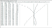
- The just made entries in the Curve-Creator window were written into a text file with the extension .qidf (QuadInkDescriptionFile) and stored in the hidden user directory C:\Users\<username>\AppData\Local\VirtualStore\Program Files (x86)\QuadToneRIP\Profiles\P800-uc\ . The file can be read, edited and printed with any text editor. QTR gets the control information for the printer from this file. I use to print a copy of it at each optimization step and reference it with the corresponding printout of the grayscale strip. If at some time I need to, I can restore the values.
- Back to the QuadToneRIP window. In the list under Curve Setup - Curve 1 load the just saved paper curve. Check that the grayscale stripe is in the right place at the top of the sheet, check all entries. These must correspond to the values recorded in point 2. If everything is OK, then PRINT.
- Let the printout dry well! Then measure the printed grayscale wedge with a spectrophotometer. Load measured values into file; cf. procedure described above in the ABW ColorPort section.
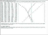
- Drag the file with the measured data to the program QTR-Linearize-Data.exe. This generates a ...-out file that can be opened with a text editor. It looks something like this: see graph below.
- The line Step = 0.00 shows the Luminance and color values of the unprinted paper. The "L" values characterize the brightness gradient. In the eample shown, L is almost linear. But this is normally not to be expected at this step. "a" and "b" represent the gray tone that results from the combination of ink color and the showing through paper tone. The line Step 100 shows the full K ink application, i.e. the tone of the pure black ink.
- In this file at LINEARIZE, mark the values between the quotes and copy them to the clipboard.
- In the Curve Creator window, click on the Linearization tab and press the Paste Values button. The clipboard now fills 21 boxes. Save (Ctrl + S). If the program reports an error, it is because the the measured L-value sequence is not monotonous. This could be due to a measurement glitch, or too much ink applied to the deep blacks, so that more ink turned into a lighter black (ink overflow effect). The latter can often be fixed by reducing the Black Boost slightly.
- Repeat steps 14 to 17. The L-curve should now run completely straight.
Are we satisfied now?
We would be satisfied if we printed our favourite image with these settings and it appeared as it does on the monitor. That would fulfill our leitmotif. Make the attempt. It would be a miracle if that were the case now. There is nothing wrong with that. We still have a lot of room for improvement.
Let's consider the file generated in the corresponding step 17. Matte papers do not achieve absolutely deep blacks, i.e. dMAX is about 1.6. Accordingly, the L curve runs through somewhat lighter gray values. In the example at Step = 50, L is around 55. The resulting image impression is therefore brighter than on the monitor. This effect is not so pronounced on satin, pearl or glossy papers, since these papers reach deeper blacks, dMAX >= 2.5, so that the straightened L curve at Step = 50 runs closer to L = 50. In keeping with my leitmotif, I will next correct matte papers, i.e. darken them. I describe the tools for this below.
Often an unbalanced color cast of the gray tones is disturbing, as in the example above. At the two ends of the step scale, i.e. paper tone and black tone, nothing or not much can be changed. What criteria should be used to design the transition?
I assume that each paper has been carefully selected to match the intended image vision. For example: I will not place a picture in which I represent a factually distanced vision on a warm, yellowish image carrier (I admit: this is a question of taste). So I'm going to get some papers that match my vision. For each of my papers, I will therefore have an idea of what the gray tone should ideally look like. I can put this idea into a measurably describable form by describing the gray tone progression in the a,b plane. The settings of QTR allow me to realize this description with a good approximation - but it takes a little work.
And it needs a little practice and thinking. The measurements produce results in the L*a*b* space. However, I can only act on those parameters that are offered in the Curve Creator window. It is also tricky because the parameters affect each other. How do the accessible parameters of the Curve Creator tool work?
"Density" controls the application range of the respective ink in relation to the Black-K scale.
"Limit" controls the amount of ink in question. In both cases, the graph that appears via "Show Curve" shows the ink progression graph, giving you insight into how the curves react.
"Highlight" affects the highlight area of the ink in question. A larger number corresponds to less ink and vice versa.
"Shadow" analogous in the shadows area.
"Gamma" shifts the center of gravity of the ink in the Curve graph. Gamma > 1 shifts to the right, Gamma < 1 to the left.
Now to the colors. In step 6 above we had measured the color inks. Let's look at this data and deduce where in the a,b space color additions shift the gray tone to. For the color inks on the matte, strongly lightened Ilford paper of the example, the color coordinates below have resulted. They can also serve as orientation for other papers.
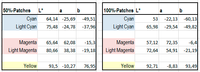
Cyan (C) and Light Cyan (LC) reduce both the a value and the b value. The b-component is shifted 2-3 times more to the negative than the a-component.
Magenta (M) and Light Magenta (LM) shift the a-component to the positive while reducing b at the same time. M acts mainly on a and affects b only slightly. With LM, the shifts are about 2:1.
C and M have a strong effect and are therefore used only for the darker grays. We will correct the lighter grays with the LC and LM inks.
Yellow (Y) is a case of his own. Y pushes almost only the b component into the positive, leaving a untouched. Therefore, Y is used to make the already "warm" gray inks even "warmer". ...which I personally think is superfluous.
One could come up with the idea of using Y to neutralize the blueish highlights on strongly lightened papers, which naturally have a strongly negative b-component there. But for this purpose one of the two "Toner Curve" tabs must be "sarificed". Often, however, both magenta and cyan toners must be used to neutralize the midtones and shadows, in what case one lacks a toner curve tool. I therefore try to neutralize the highlights with the LM ink even on heavily lightened papers.
Procedure:
In the next work package I try to push the L-curve through the 50/50 point, whereby its bright side should run as linear as possible and only below Step 75-80 turn towards the saturation value at Step = 100. Tools for this are the parameters HighLight, Shadow and Gamma under the "Gray Curve" tab, whereby Overlap only needs to be varied in rare cases (field normally remains empty). I change the Density and Limit parameters of the K, LK, and LLK inks, which are accessible in the main window under the Ink Setup tab, extremely carefully and then sparingly. After each parameter change, I print a grayscale strip, let it dry, and then measure it with the spectrophotometer. I save the respective settings. Until one has gained a good feeling for the reactions of the system to parameter changes, it is advisable to note the parameter changes and assign them to the measurement printouts. With some practice it works well to set the desired brightness gradient of the L-curve with a few iterations.
After that I start to neutralize the gray gradient by switching on the color inks in the main window. Initially, only the lighter grays with the Light inks, then the shadows with the Solid inks. Tools are under the "Toner Curve" tabs. In the Ilford paper example, the parameters below (.qidf file) produced the result shown.
PRINTER=QuadP800
CURVE_NAME=UCmk-IlfordPremiumMattDuo200-neutral
GRAPH_CURVE=YES
N_OF_INKS=8
DEFAULT_INK_LIMIT=35
BOOST_K=50
LIMIT_K=35
LIMIT_C=5
LIMIT_M=0
LIMIT_Y=0
LIMIT_LC=5
LIMIT_LM=3
LIMIT_LK=34
LIMIT_LLK=35
N_OF_GRAY_PARTS=3
GRAY_INK_1=K
GRAY_VAL_1=100
GRAY_INK_2=LK
GRAY_VAL_2=35
GRAY_INK_3=LLK
GRAY_VAL_3=14
GRAY_HIGHLIGHT=5
GRAY_SHADOW=6
GRAY_OVERLAP=
GRAY_GAMMA=0,7
GRAY_CURVE=
N_OF_TONER_PARTS=2
TONER_INK_1=C
TONER_VAL_1=100
TONER_INK_2=LC
TONER_VAL_2=60
TONER_HIGHLIGHT=1
TONER_SHADOW=2
TONER_GAMMA=1
TONER_CURVE=
N_OF_TONER_2_PARTS=2
TONER_2_INK_1=M
TONER_2_VAL_1=95
TONER_2_INK_2=LM
TONER_2_VAL_2=25
TONER_2_HIGHLIGHT=10
TONER_2_SHADOW=10
TONER_2_GAMMA=1
TONER_2_CURVE=
N_OF_UNUSED=1
UNUSED_INK_1=Y
LINEARIZE="95,55 92,73 89,47 85,68 81,69 77,66 73,84 69,63 65,33 61,46 58,11 54,11 50,85 47,33 44,03 39,85 35,12 30,7 26,59 22,97 18,78 "
Remarks:
-- Regarding the quality of the L*a*b* readings: if I measure one and the same well-dried grayscale wedge twice in a row, the results differ by a maximum of about 0.15 units. If I measure two different printouts of the gray scale wedge, which are also on two different sheets of paper from the same package, I register a variability in the individual L, a, or b values of a maximum of 0.3 Lab units. The first case is determined by the measurement accuracy of the spectrophotometer, while in the second case the variability of the printing process and the paper quality also enter. Is this a lot or a little? On the L*a*b* scale, color locations with a distance below 0.3 units are considered visually indistinguishable. The measurements are to be interpreted in this sense. Thus, the variability of the measured values in the examples is mostly below the perceptibility threshold. Or in other words: If two gray levels differ by more than 0.3 units, this will be perceivable in a direct side-by-side comparison. Color differences are to be determined in terms of a Euclidean metric - distance d = [(\Delta L*)^2+(\Delta a*)^2+(\Delta b*)^2]^½ .
-- The QTR Curve Creator stores the self-created profiles in hidden directories - for example for the Epson SC-P800 printer in:
C:\Users\<username>\AppData\Local\VirtualStore\Program Files (x86)\QuadToneRIP\Profiles\P800-uc\
and
C:\Users\<username>\AppData\Local\VirtualStore\Program Files (x86)\QuadToneRIP\QuadTone\QuadP800
For the Epson SC-P800 printer, settings and profiles for some papers are listed in the Downloads section
COMPARISON ABW TO QTR AND FINAL NOTES.
- Both printing methods can achieve gray gradients and ink tones that will satisfy even a critical black and white enthusiast.
- Respective procedure to arrive at the desired color balance: With QTR, inks can be accessed directly. The ABW window offers visibly fewer adjustable parameters. However, these are not ink-related, but refer to the a,b color coordinates. This makes operation more intuitive. However, if you want to print "black only", i.e. without mixing color inks, only QTR provides a tool. It would be nice if Epson would include this possibility in the ABW driver.
- Image sharpness: I could not find any difference between the two programs, even with the magnifying glass, provided the paper parameters were set the same. The paper parameters can be set directly in the printer window in ABW, but in QTR they have to be set on the printer control panel. In both cases, it is important to know the corresponding EPSON counterpart for "foreign" papers, because the printer obtains the information for the mechanical settings of the paper transport from it. Note on the SC-P800's paper transport: if you print glossy papers via the upright sheet feed, the transport mechanism can leave a fine, ugly dot trail ("pizza wheel trail") on sensitive surfaces, rendering the image unusable. It is better to process these papers via the front feed.
- With the generic profiles for original Epson papers, acceptable results can be achieved with other brands with both programs. The selection of papers is naturally somewhat richer with the ABW driver. For some printer types, it may be worthwhile to download the printer driver from the American website. I Had noticed some years ago that these come with a wider variety of paper profiles. But for both printing programs, exhibition quality can only be achieved by creating your own profile.
- As with the paper manufacturers' ICC profile databases for color printing it would be desirable if they could provide optimized B&W settings for their papers. However, as shown above, there are different viewpoints among black and white enthusiasts, e.g. Linear L-curve versus 50/50 curve. A manufacturer would have to cater to all these viewpoints, which probably is not economical. Unfortunately, I also don't know of a place where you could upload your own curves/profiles to let other enthusiasts benefit from the manufacturing effort.
- The paper market is puzzling. As a Google search shows, there is a large amount of paper merchants with a large supply of paper. All of this paper has to be made somewhere. It is unlikely that there are as many manufacturers as there are paper brands offered in stores. Therefore, identical papers must be in circulation under different names. If one finds such correspondences, the profiling effort can be reduced accordingly. For example, I have found that I can print Ilford Galerie Premium Matt Duo 200, Tecco PD190 DUO Matt, Ilford Galerie Heavyweight Duo Matt and Tecco PD305 Duo Matt papers with one and the same profile and get results that are metrologically indistinguishable.
The grain direction of double-sided papers
Double-sided inkjet papers are often used for photo books. In this case, the grain direction of the paper is an additional aspect that should be considered. If you want to create a "real book", i.e. a bound book, the grain direction of the paper fibers should run parallel to the spine, i.e. to the fold. If the book pages are only to be held together by a ring binding, a grain direction perpendicular to the ring binding will make it easier to turn the pages. For these projects, one must therefore rely on the paper manufacturer's specifications. Of the papers listed in the download area, only Hahnemühle Photo Rag Book & Album carries a specified grain direction.
If the book is planned in DIN A4 format, the print will have to be made on DIN A3 paper. In this case, a running direction along the short side of the paper, so-called "short grain", is required. With Hahnemühle Photo Rag Book & Album paper, this is guaranteed. Although not specified with the Hahnemühle Photo Rag Duo 276 and Matt Fibre Duo 210 papers, the DIN A3 papers were short grained as well. With the Ilford/Tecco Duo Combo, however, it was consistently the other way around. So these are not suitable for bookbinding because of the wrong grain direction. I tried it anyway. Looking back, I regret it. Binding a book yourself is a lot of fun, and you take the necessary time to do it. But if the final result does not match the expectation, you are disappointed. So, print on paper with the correct grain direction, even if the paper costs are somewhat higher!
I have also observed that with papers of the Ilford/Tecco Combo, dark areas imprint onto the opposite pages. Apparently on these papers the pigments are not fully retained in the ink receiving layer. I tried to reduce the ink deposition, but that resulted in rather flat shadows. I did not observe this with the Hahnemühle combo.
From my point of view, papers from the Ilford/Tecco Combo are therefore only suitable for designing spiral-bound books for which long grain orientation is supposed to be used. In this case, I would also plan for an additional separating sheet of transparent paper (e.g. tracing paper like Hahnemühle No. 10 622 401) to avoid the impression of blacks on opposite photo pages.
Update history
2021/01/25 - v2-ABW settings for Ilford Galerie Premium Matt Duo 200:
This paper - as well as the apparently identically coated Ilford Galerie Premium Heavyweight Duo Matt, Tecco PD190 DUO Matt, and Tecco PD305 DUO Matt papers - have a strongly brightened base, as represented by the strongly negative D50-b coordinate b=-8. Papers that contain this much brightening agent are difficult to trim to a neutral gray tone. Color inks need to be applied very densely to compensate the brightener. The v2-version increases the horizontal component by one unit in the ABW driver. The previously somewhat greenish midtones thus transition a bit more harmoniously into the warm-toned tones of the full black application. The QTR driver allows a more targeted intervention in the ink tone, so that with these papers somewhat more harmonious gray gradients can be achieved.